Brand identity
A logo system, color and type rules, brand voice and an asset kit your team can actually use. Built to survive contact with a website, an invoice and a phone screen.
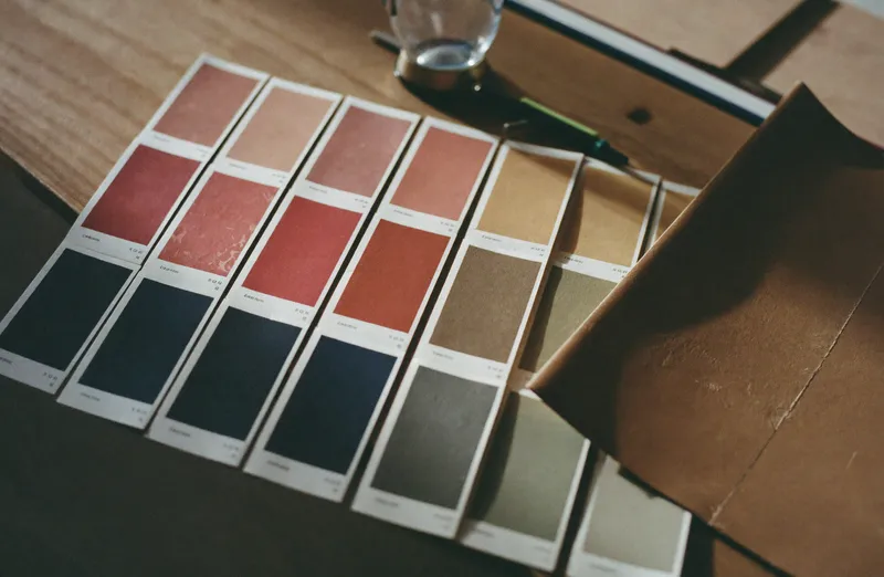
What a brand kit is for
Not to win a design award. To let somebody who is not a designer produce something on brand at four in the afternoon without asking anyone.
That is the test I build against. If your operations manager cannot make a compliant social post, quote document or email header from what I hand over, the identity has failed regardless of how it looks in a presentation.
Most identity packages fail this test. They are beautiful PDFs describing a logo, with no working files, no guidance on the awkward cases, and no answer for what happens when the logo has to sit on a photograph.
What gets built
A logo system rather than a logo: primary, stacked, horizontal, a mark on its own, and a single color version that survives being embroidered, etched or faxed. Every real business eventually needs all of these.
Color with actual rules. Which color carries a page, which one is for emphasis only, and which combinations pass accessibility contrast. A palette without contrast rules produces a website that fails audit on day one.
Type with a scale, not just two font names. Which size for what, what line height, and what to do when a headline is four words instead of twelve.
Voice as examples rather than adjectives. Three sentences written the right way and the same three written the wrong way teaches a team more than a page of words like bold, authentic and human.
How it connects to the rest
I build identity mainly for clients whose site I am also building or about to build, because an identity designed without a website in mind tends to break the moment it meets one.
If you want identity work alone that is fine, and I will still design it against real applications: a homepage, a service page, a quote document and a phone screen, so you can see it working before you sign it off.
Deliverables
Fixed price per project. Usually runs alongside a build, and can be bought on its own.
- 01
Logo system
Primary, stacked, horizontal, standalone mark and single color versions, delivered in SVG, PNG and vector source.
- 02
Color system
Palette with defined roles and accessibility contrast pairs that pass WCAG AA.
- 03
Typography scale
Type pairing plus a working scale for headings, body, captions and interface text.
- 04
Brand voice
Tone principles with written before and after examples rather than adjectives.
- 05
Application mockups
The identity shown on a homepage, a service page, a document and a phone screen.
- 06
Asset kit and guidelines
Working files, a short usage guide and a folder your team can actually navigate.
Common questions
Do I need a rebrand or just a better website?
Most of the time, a better website. A rebrand is worth doing when the name or positioning has genuinely changed, when the current identity cannot be applied consistently, or when it actively misrepresents what you now sell. If none of those are true, spend the money on the site.
How long does an identity project take?
Two to four weeks for a focused kit, longer if it runs alongside a website build. The slow part is decision making on your side, so I keep the number of options deliberately small. Twenty logo concepts is a way of avoiding a recommendation.
Do I own the files?
Yes, outright, including working source files, on final payment. No licensing arrangement, no ongoing fee to use your own logo.
Can you work with our existing logo?
Often the better option. If the mark is sound, I build the system around it: color rules, type, voice and applications. That costs less and keeps the recognition you have already paid for.
Want a straight answer about your site?
Send me the URL. I will tell you what is holding it back and what I would do about it, before you commit to anything.